Need help in using our WordPress theme?
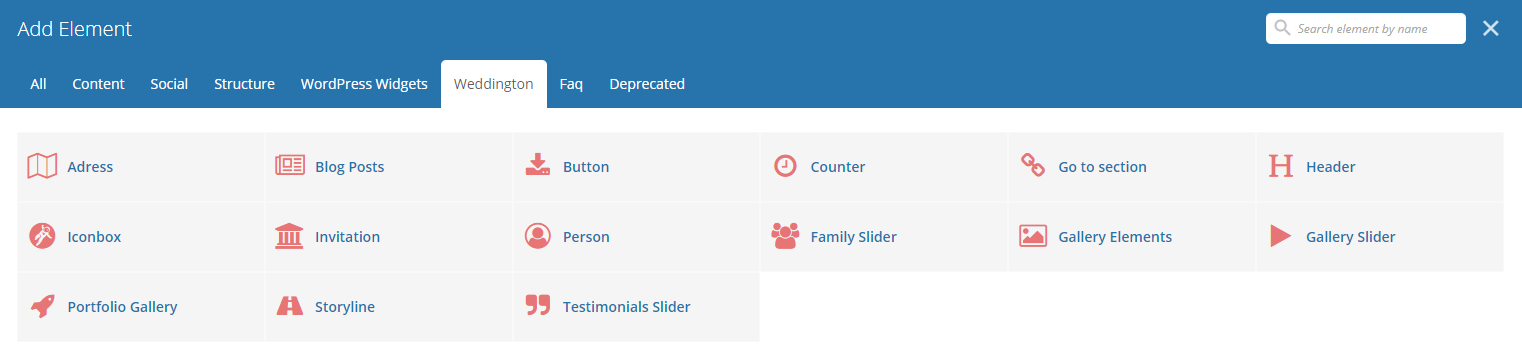
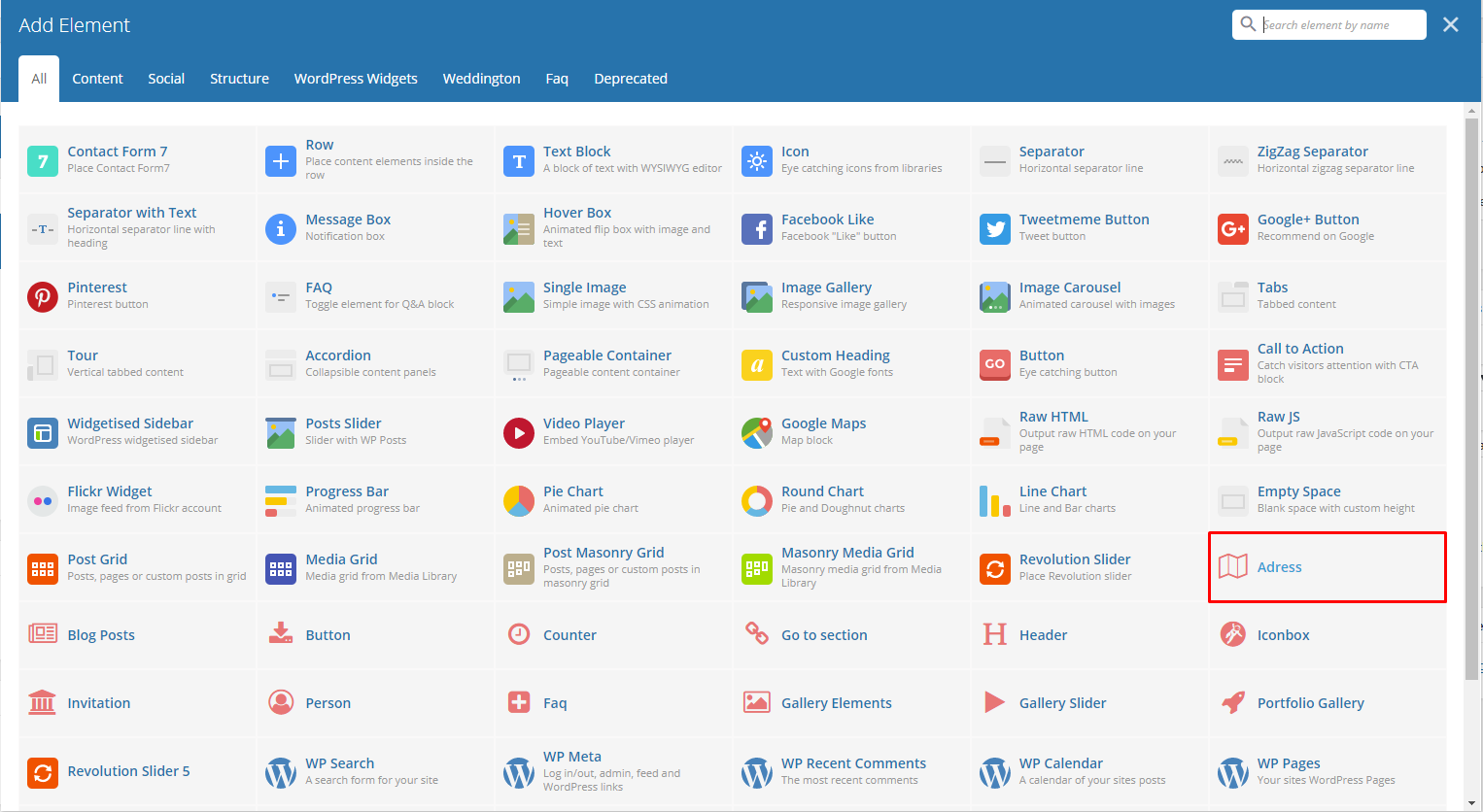
With Weddington, comes custom shortcodes for (Visual Composer) VC that are used to show content created in Weddington.
Below you will find short information about this Visual Composer elements:
|
|
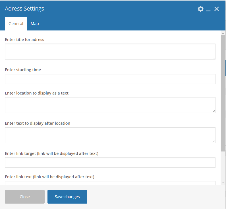
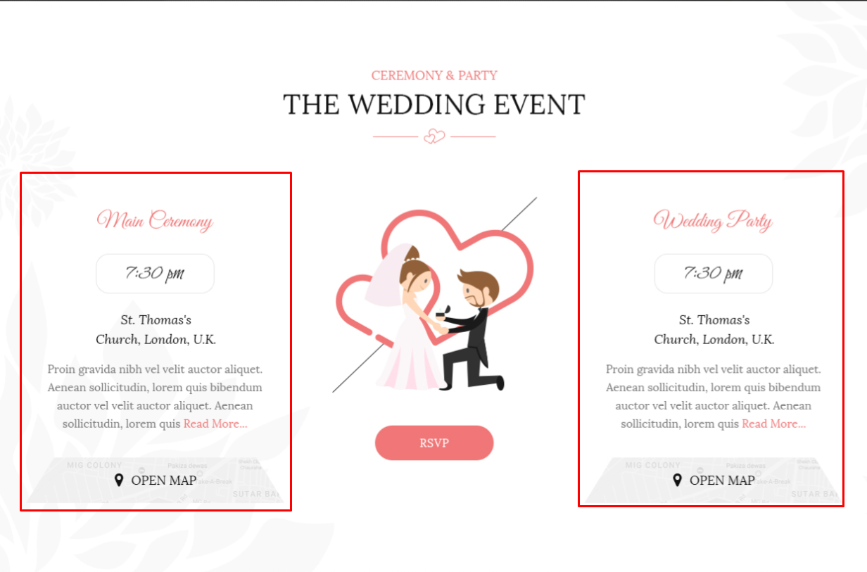
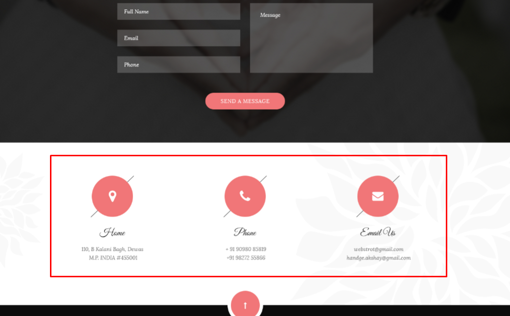
This element will let you display a small detail for an address/event.
|
-General Tab-
- Enter title for address - Title for the address/event.
- Enter starting time - Starting time for the event.
- Enter location to display as a text - Location where the event is held.
- Enter text to display after location - Text you want to display after the location.
- Enter link target (link will be displayed after text) - The page where the link will redirect.
- Enter link text (link will be displayed after text) - Text for the link.
- Display button with map popup? - Option to add a button for a map popup.
-Map Tab-
- Type text to the popup button - Text displayed in the button with map popup.
- Choose icon for map popup button - Icon beside the text in the button with map popup.
|
|
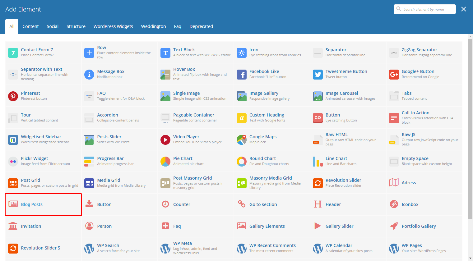
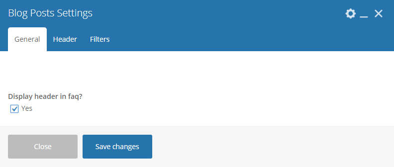
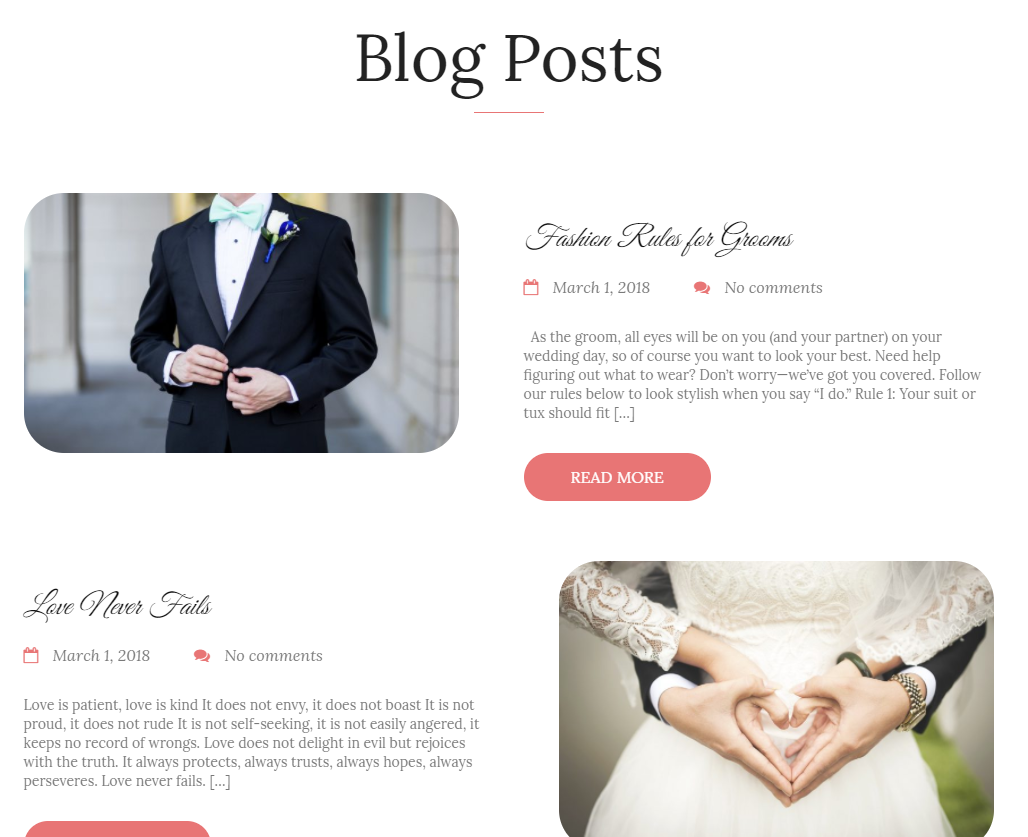
This theme comes with VC element that give you the option to display the blog posts.
|
-General Tab-
- Display header in faq - Option to add a header before the blog posts. When selected, the- header tab will appear.
-Header Tab-
- Header type - The type of design the header will look.
- Header Color - Color scheme of the header: White or Dark
- Select alignment type - Alignment of the title.
- Display text after subtitle - Option to display the subtitle after the title.
- Display button in header - Option to add a button in the header.
- Header level
- Header title - What is written inside the header.
- Header title font size - Font size of the header’s title.
- Header title custom color - Font color of the title.
- Header subtitle custom title - What is written as the subtitle.
- Header subtitle font size - Font size of the subtitle.
- Header subtitle color - Font color of the subtitle.
- Display custom image for header decoration - Option to display image for header decoration.
- Upload custom image for decoration - Upload/select an image to make as decoration for the header.
- Header top margin [px] - Size of the top margin.
- Header bottom margin [px] - Size of the bottom margin.
- Optional text - Add an optional text below the header.
- Header text font size [px] - Size of the font for the optional text.
- Header text color - Font color of the optional text.
- Button title - Title for the button in the header.
- Button size - Size of the button in the header.
- Full width button - Option to have the button in full width.
- Button style - Style of how the button looks.
- Button link - Where the button will redirect.
- Button icon - Icon in the button.
- Select target for the link - Where the link is going to open.
-Filters Tab-
- Limit - Set results limit.
- Skip X elements - Skip a number of elements from the results.
- Order - How the posts order looks.
- Order by - How the posts are ordered.
- Specify post objects - Only selected posts are shown.
- Exclude post objects - None of the selected posts will be displayed.
- Specify terms of category taxonomy - Only show posts under the categories.
- Exclude terms of category taxonomy - None of the posts under the categories are shown.
- Specify post tags - Only show posts with selected tags.
- Keyword search - Show items with certain keyword.
|
|
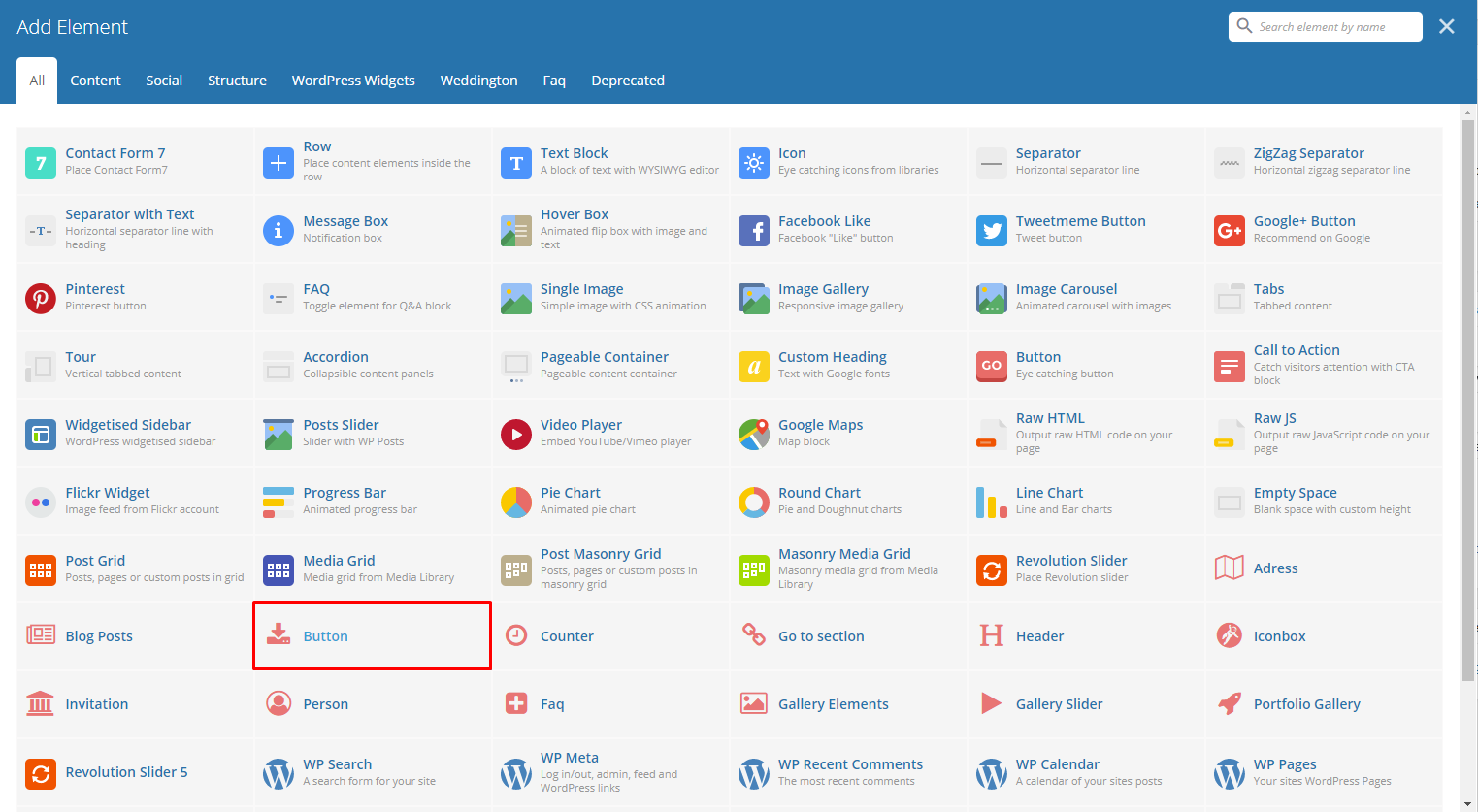
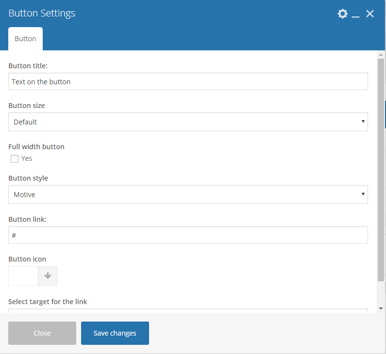
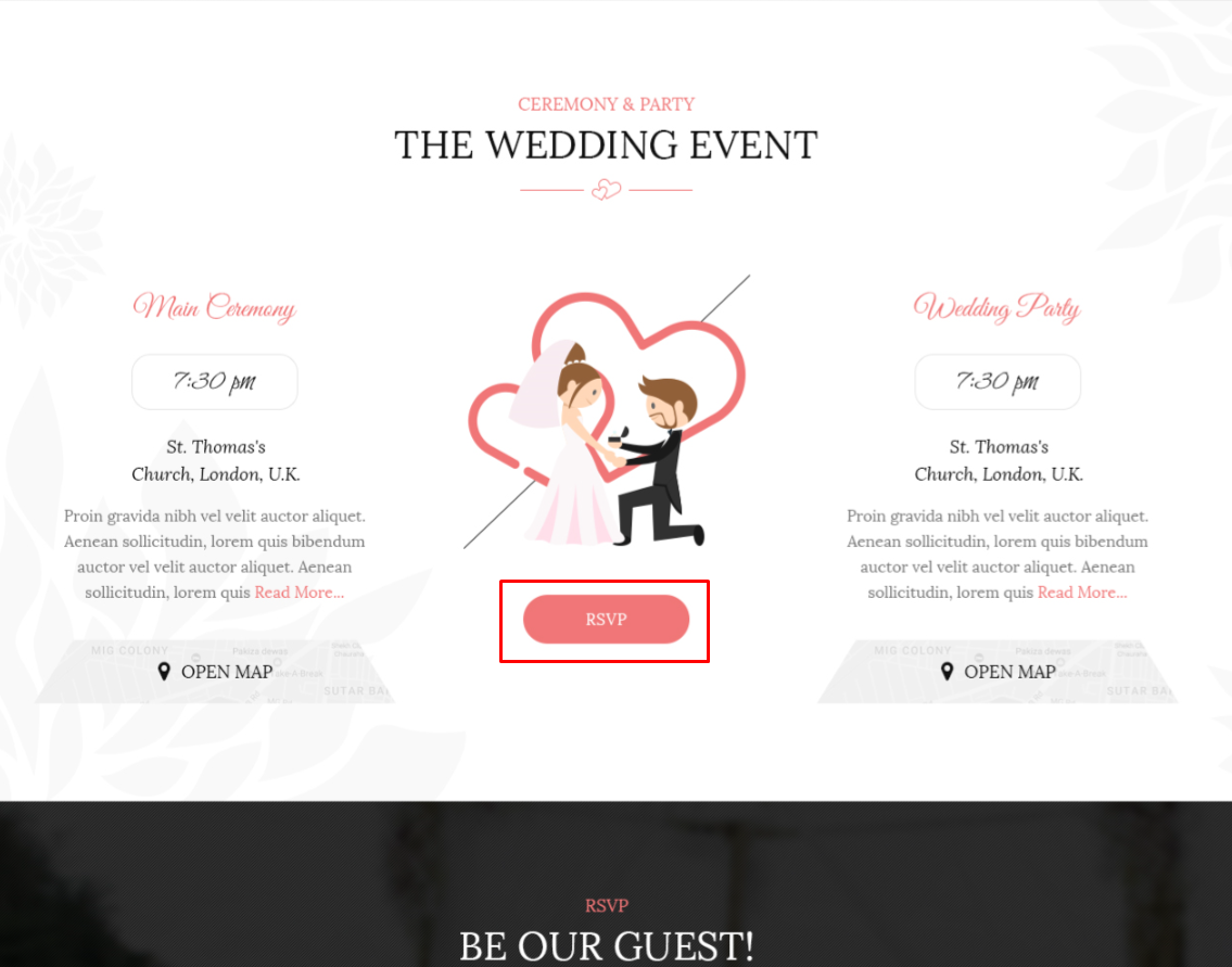
This theme comes with VC element that give you the option to create buttons that can be used in the theme.
|
-Button Tab-
- Button title - The label of the button.
- Button size - Size of the button.
- Full width button - Option to make the button full width.
- Button style - Options for the color of the button.
- Button link - URL link for the button.
- Button icon - Add the icon you would like to use.
- Select target for the link - Where the link is going to open.
|
|
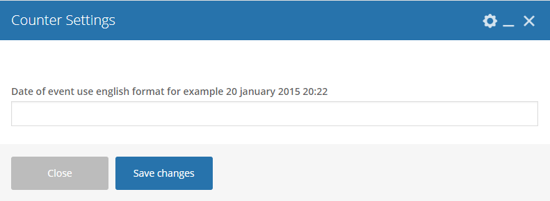
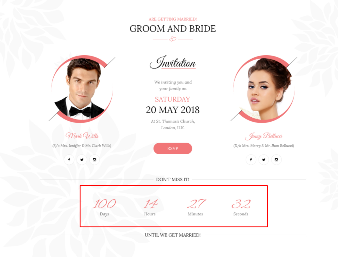
This will let you a dynamic counter from 0 to the number you set the counter on your page.
|
- Date of event - use english format for example 20 january 2015 20:22
|
|
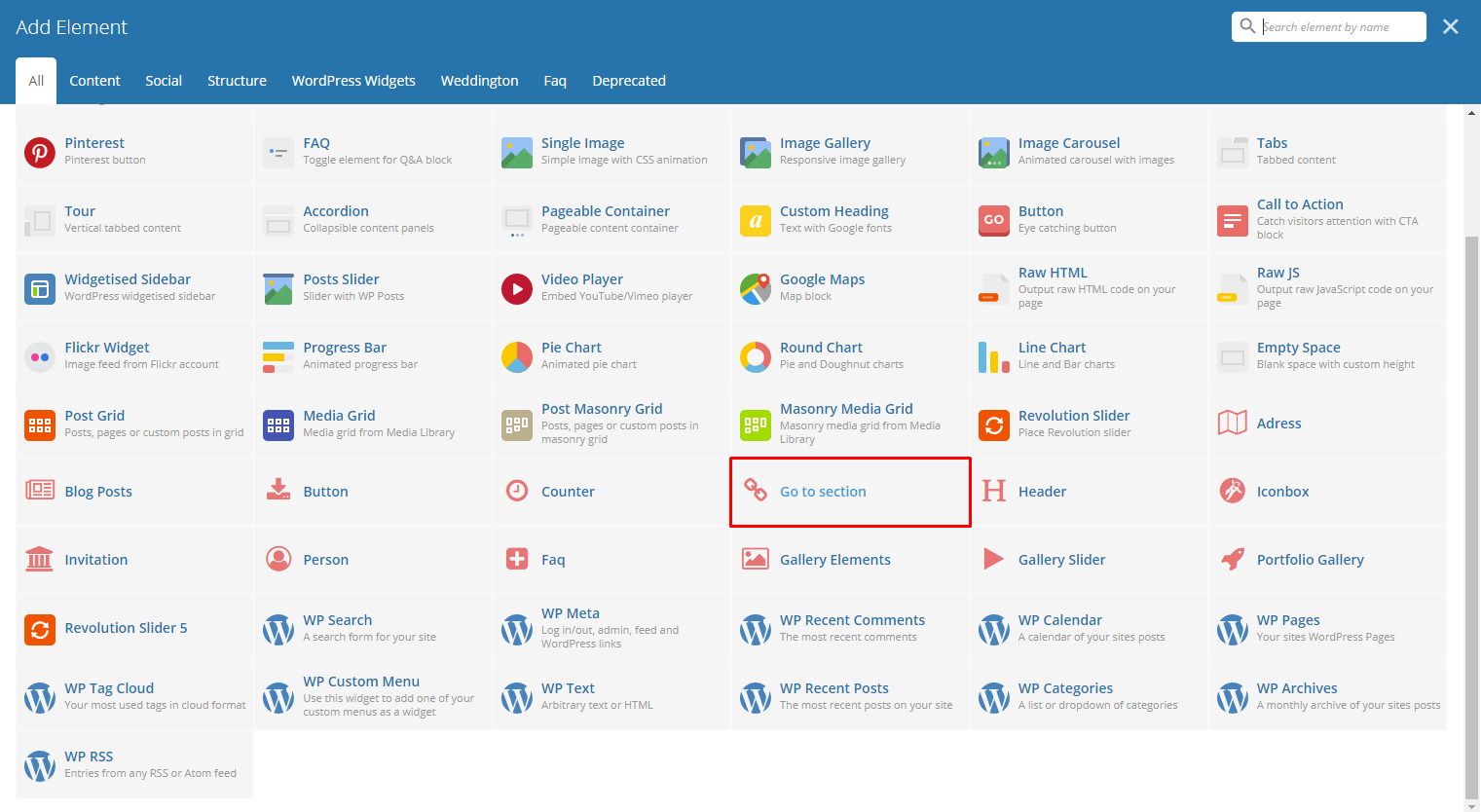
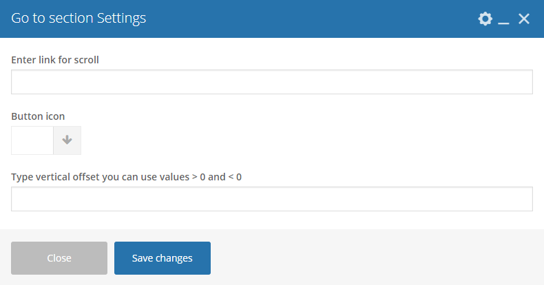
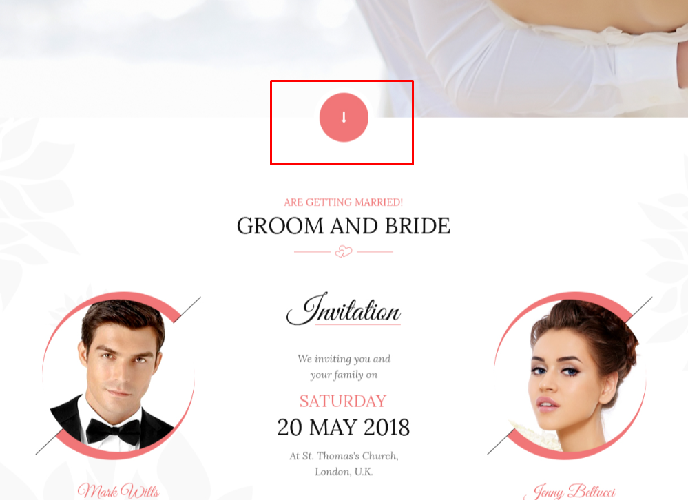
This element will let you add an icon that can direct you to a part of the page when clicked. You must set an ID for the part that you would like direct to by adding the ID at the Row/Section Settings.
|
-General Tab-
- Enter link for scroll - The row/section ID of the area you want to be directed.
- Button icon - Add the icon you would like to use.
- Type vertical offset you can use values > 0 and < 0
|
|
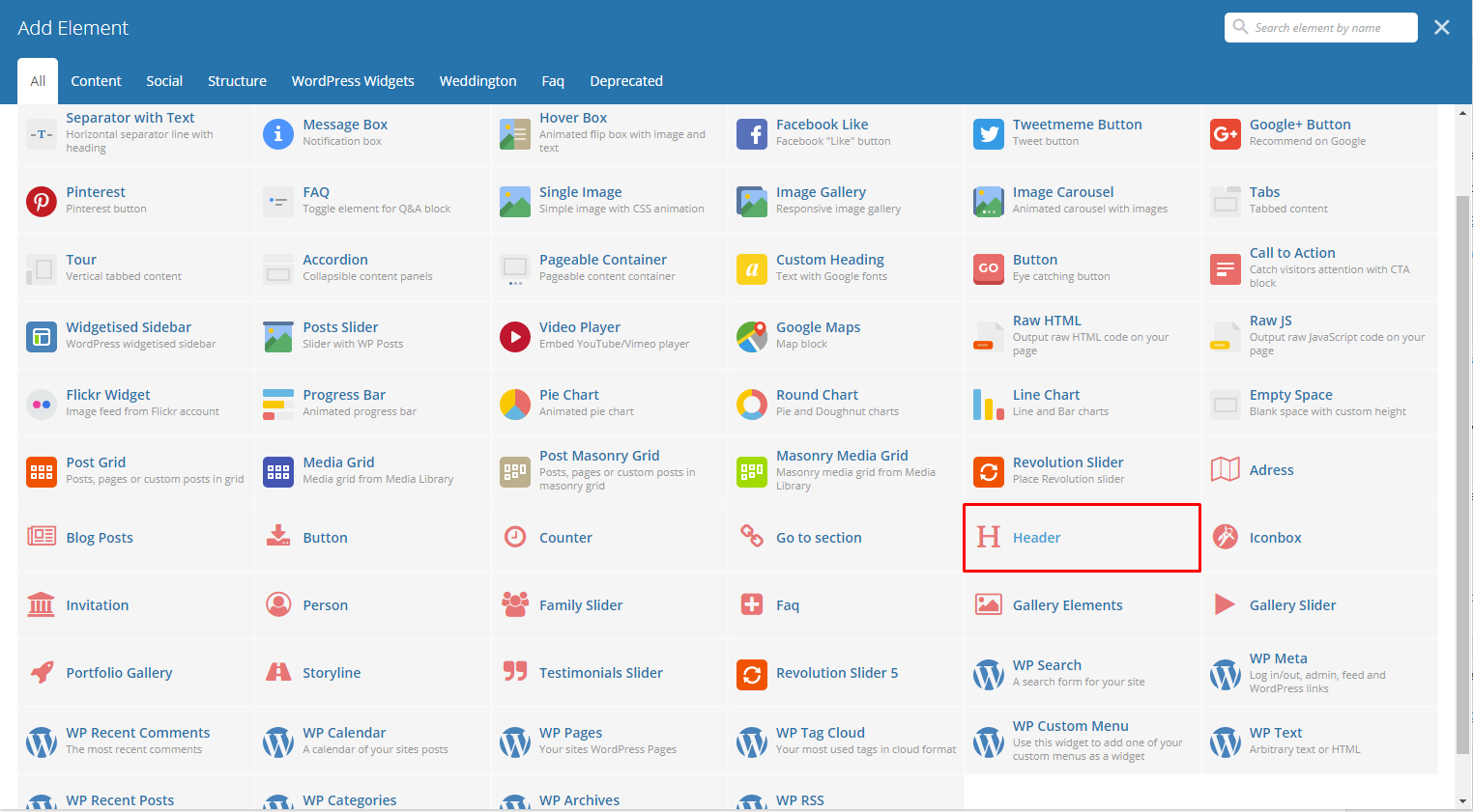
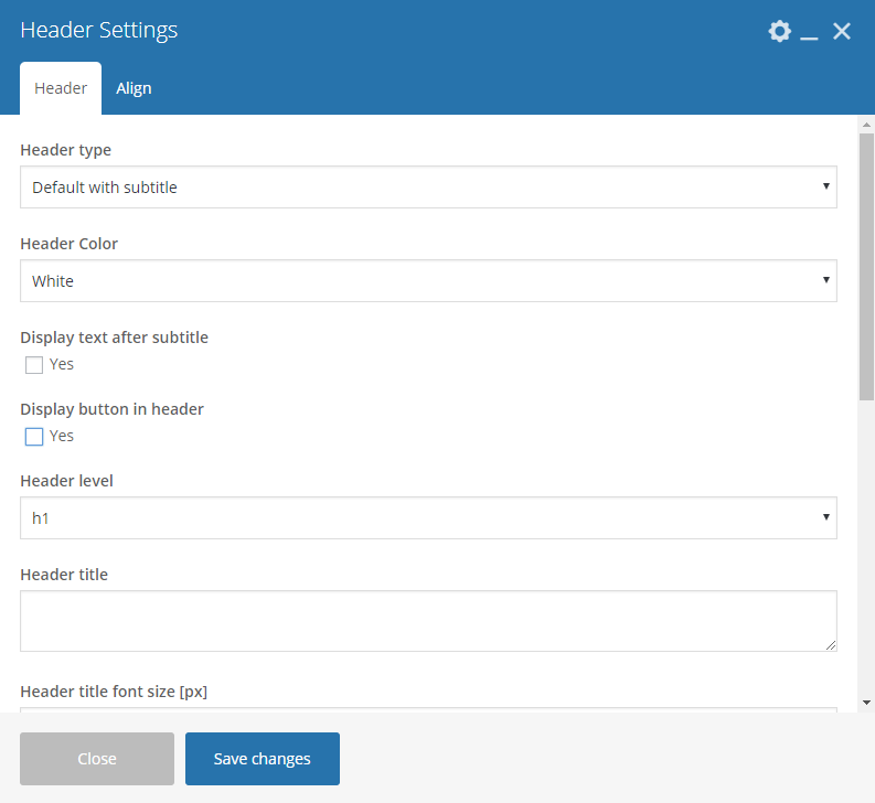
The element is a custom header for Weddington.
|
-Header Tab-
- Header type - Set the type of header to use.
- Header Color - Color scheme of the header: White or Dark
- Display text after subtitle - If YES, Text tab will show. Option to display the text after the title.
- Display button in header - If YES, Button tab will show. Option to add a button in the header.
- Header level
- Header title - What is written inside the header.
- Header title font size - Font size of the header’s title.
- Header title custom color - Font color of the title.
- Header subtitle custom title - What is written as the subtitle.
- Header subtitle font size - Font size of the subtitle.
- Header subtitle color - Font color of the subtitle.
- Display custom image for header decoration - Option to add an image for header decoration.
- Upload custom image for decoration - If Display custom image for header decoration is YES, this option will show. Add an image as header decoration.
- Header top margin - Size of the top margin.
- Header bottom margin - Size of the bottom margin.
-Align-
- Select align type - Set the alignment of the header.
-Text Tab-
- Optional text - Text that will show after the header title.
- Header text font size [px] - Font size for the text.
- Header text color - Font color for the text.
-Button Tab-
- Button title - The label of the button.
- Button size - Size of the button.
- Full width button - Option to make the button full width.
- Button style - Options for the color of the button.
- Button link - URL link for the button.
- Button icon - Add the icon you would like to use.
- Select target for the link - Where the link is going to open.
|
|
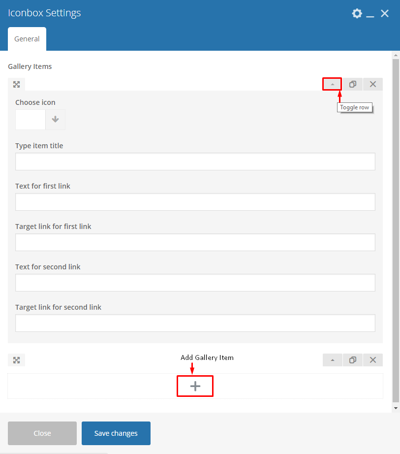
This will add an icon box to your site.
|
-General Tab-
- Gallery Items - Click toggle row to show Gallery items options. To add more Gallery items, click on the plus(+) sign.
- Choose icon - Add the icon you would like to use.
- Type item title - Text that will show after the Icon.
- Text for first link - Text for the first link.
- Target link for first link - URL link for the first link.
- Text for second link - Text for the second link.
- Target link for second link - URL link for the second link.
|
|
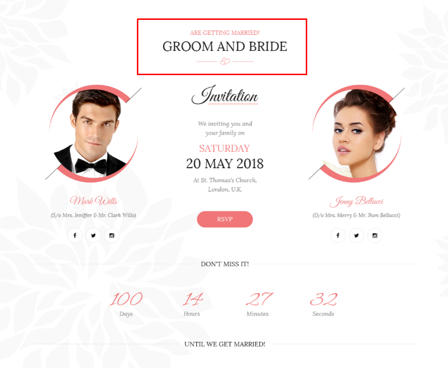
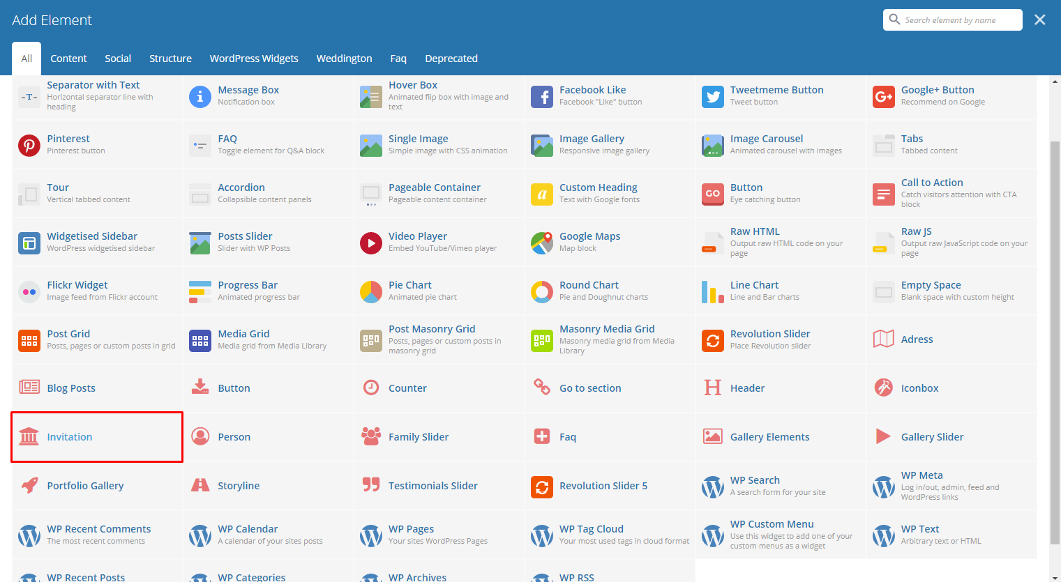
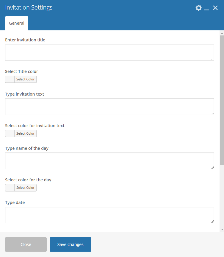
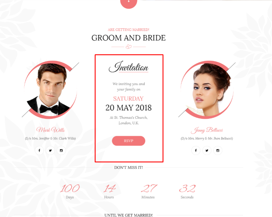
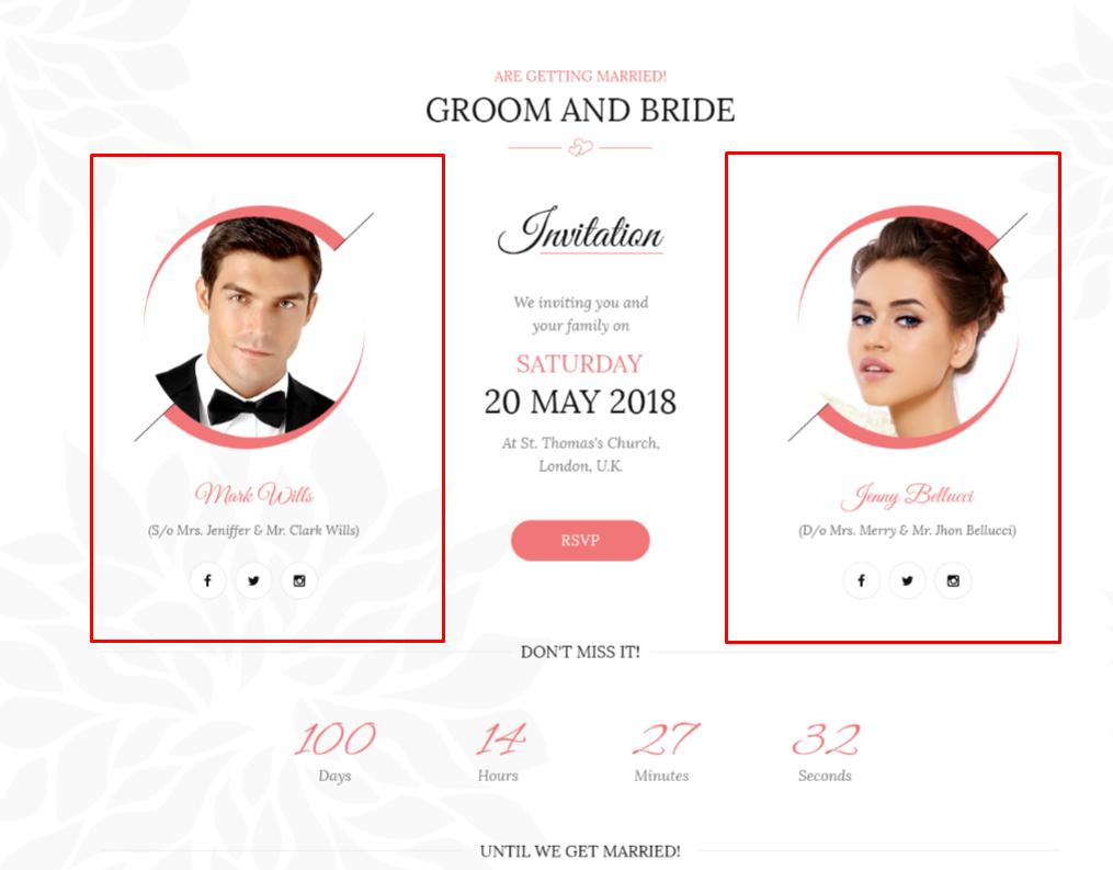
This element will let you add details for the event that would look like an invitation.
|
-General Tabs-
- Enter invitation title - Title for the invitation.
- Select Title color - Font color for the invitation title.
- Type invitation text - Text after the title.
- Select color for invitation text - Font color for the invitation text.
- Type name of the day - The day of the event. Example: Saturday
- Select color for the day - Font color for the day.
- Type date - Date of the event.
- Select date color - Font color for the date.
- Enter place address - The location of the event.
- Select color for address - Font color for the address.
- Display button in header - Option to add a button in the invitation.
|
|
This element lets you add a picture with details about what that person’s title in the event.
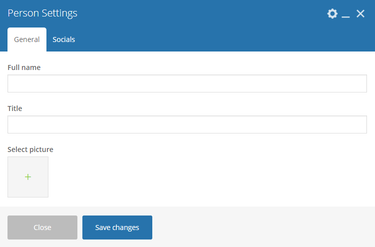
|
-General Tab-
- Full Name - Option to set the promo boxes to move by itself.
- Title - Option to use a dotted slider as navigation.
- Select picture - Option to use an arrow slider as navigation.
-Socials-
Social Icons - Click toggle row to show Social Icons options. To add more Social Icons, click on the plus(+) sign.
Note
Use text-center class to center this content so it will be centered on mobile correctly.
- Select Icon - Choose the icon you want to use.
- Type Link - URL link for the page you want to direct.
|
|
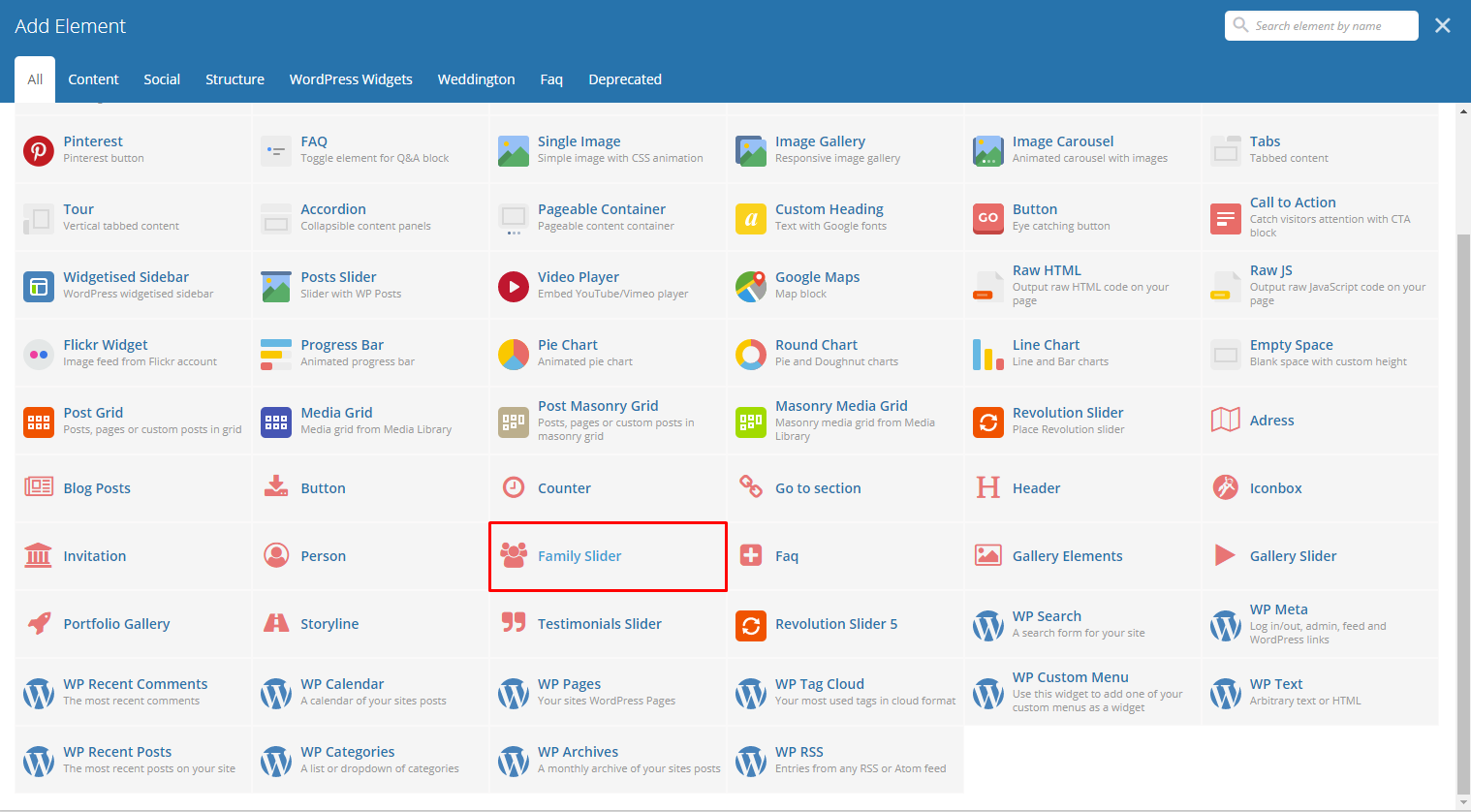
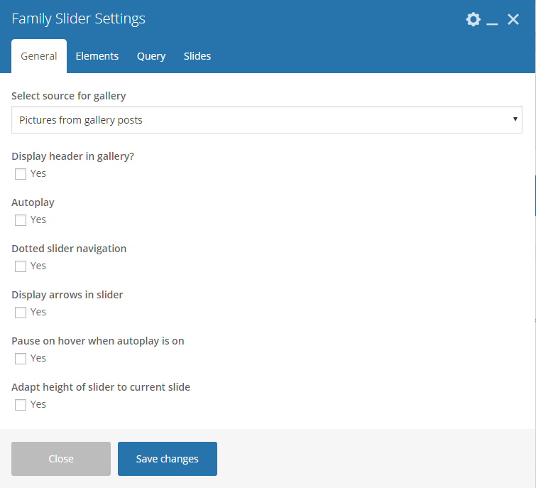
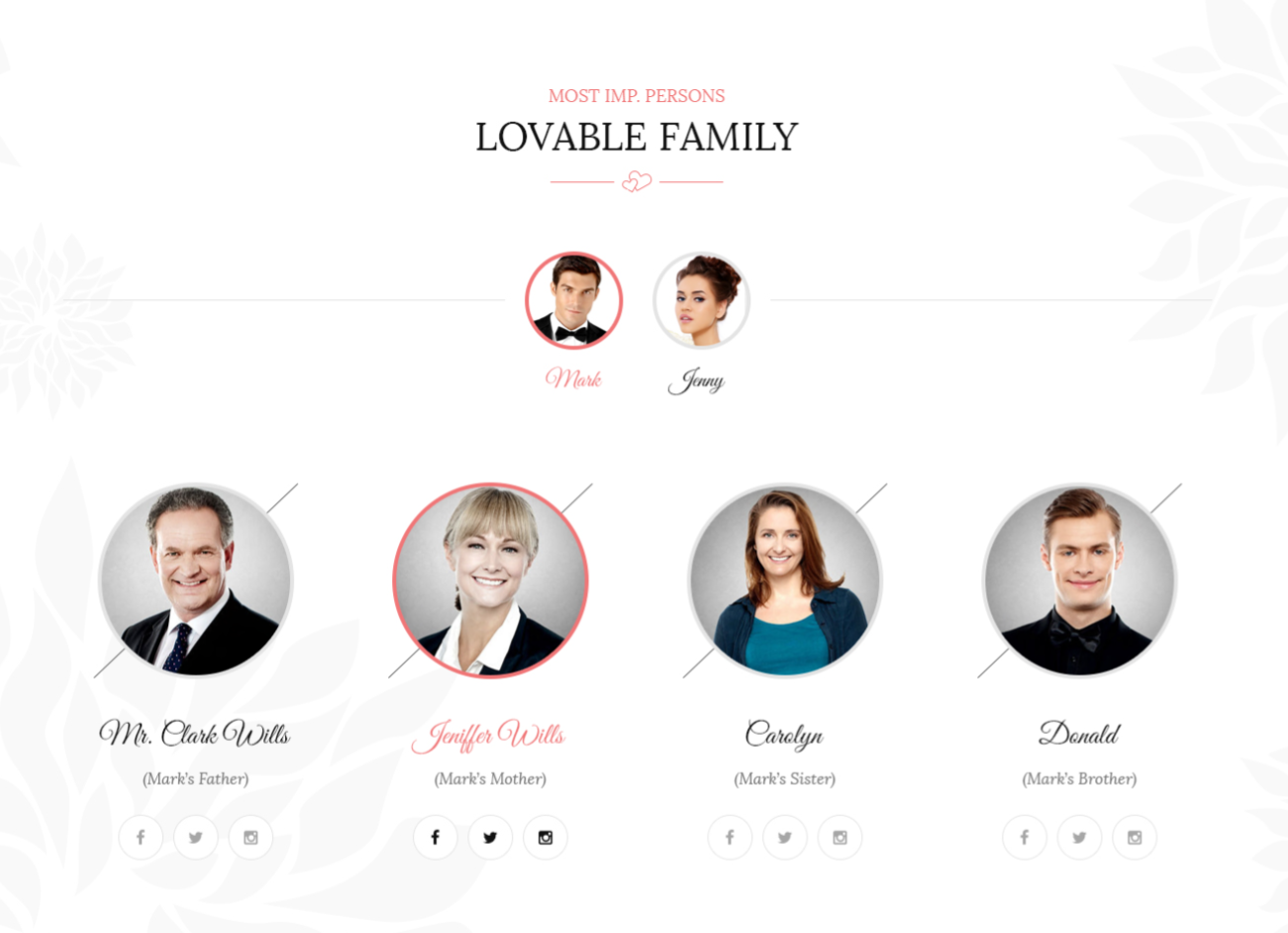
This element will let you add custom family member or items from Family.
|
-General Tab-
- Select source for gallery - Select where to get the source of the gallery.
- Display header in gallery? - Option to display a header before the family slider.
- Autoplay - Option to make the slider move by itself.
- Dotted slider navigation - Option to show dotted slider navigation.
- Display arrows in slider - Option to show arrow slider navigation.
- Pause on hover when autoplay is on - Option to pause autoplay when the mouse pointer is hovering.
- Adapt height of slider to current slide - Option to adapt the height of the slider.
-Elements Tab-
Used when Select source for gallery is set to Pictures from custom content.
Note
Click toggle row to show Slider Categories and Slider Items options. To add more Slider Categories and Slider Items, click on the plus(+) sign.
Slider categories - Create a Family category to group all family members.
- Type category title - Title of the family category.
- Choose picture for category - Add an image to associate with the family category.
Slider Items - Create a Family member with it’s details.
- Type item title - Title/Name of the member.
- Type item description - The description of the member.
- Type item categories (use | as a separator) - Category to group the member.
- Choose picture - Image to associate with the member.
- 1. Choose icon - Icon to add below the details of the member.
- 1. Type link for icon - URL link for the icon.
- 2. Choose icon - Icon to add below the details of the member.
- 2. Type link for icon -URL link for the icon.
- 3. Choose icon - Icon to add below the details of the member.
- 3. Type link for icon -URL link for the icon.
-Query Tab-
Note
To control the output of the Family Slider, you can use the information on this tab.
- Limit - Set how many Family items will show. Set to -1 to show all.
- Skip X elements - Skip a number of Family items from the results.
- Order - How the Family items order looks.
- Order by - How the Family items are ordered.
- Specify Family - Only selected Family items are shown.
- Exclude Family - None of the selected Family items will be displayed.
- Specify Family Categories - Only show Family items under the categories.
- Exclude Family Categories - None of the Family items under the categories are shown.
- Specify post tags - Only show Family items with selected tags.
- Keyword search - Show Family items with certain keyword.
-Slides Tab-
- Slides to show - Number of slides to show.
- Slides to show on tablets - Number of slides to show on a tablet platform.
- Slides to show on phablets - Number of slides to show on a phablet platform.
- Slides to show on phones - Number of slides to show on a phone platform.
- Set initial slide - Set the initial slider that moves.
|
|
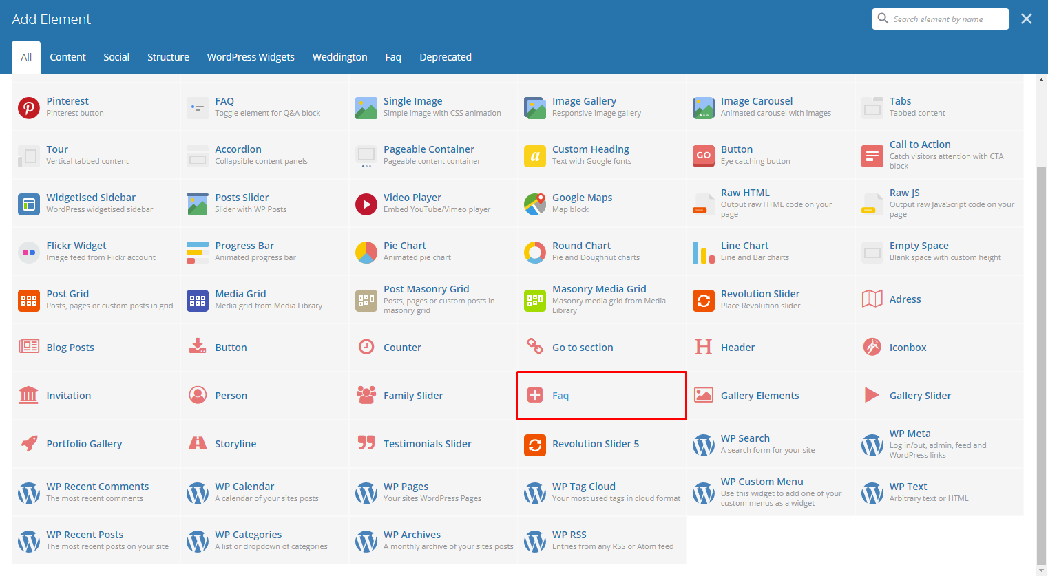
This element will let you display custom Faq or items from Faq.
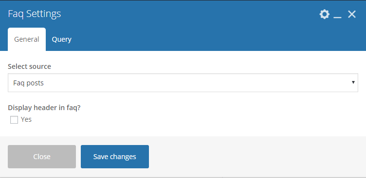
|
-General Tab-
- Select source - Select where to get the source.
- Display header in faq? - Option to display a header before the Faq.
-Query Tab-
- Limit - Set results limit.
- Skip X elements - Skip a number of elements from the results.
- Order - How the posts order looks.
- Order by - How the posts are ordered.
- Specify Faq - Only selected posts are shown.
- Exclude Faq - None of the selected posts will be displayed.
- Specify Faq Categories - Only show posts under the categories.
- Exclude Faq Categories - None of the posts under the categories are shown.
- Specify post tags - Only show posts with selected tags.
- Keyword search - Show items with certain keyword.
|
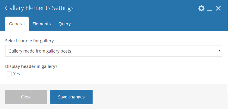
This element lets you add custom gallery items or items from Gallery.
|
-General Tab-
- Select source for gallery - Select where to get the source.
- Display header in gallery? - Option to display a header before the family slider.
-Elements Tab-
Used when Select source for gallery is set to Gallery made from custom content or Pictures from custom content.
Note
Click toggle row to show Gallery Items options. To add more Gallery Items, click on the plus(+) sign.
Gallery Items
- Type item title - Title of the item.
- Choose picture - Add an image to associate with the item.
-Query Tab-
- Limit - Set how many items will show. Set to -1 to show all.
- Skip X elements - Skip a number of elements from the results.
- Order - How the posts order looks.
- Order by - How the posts are ordered.
- Specify Gallery - Only selected posts are shown.
- Exclude Gallery - None of the selected posts will be displayed.
- Specify Gallery Categories - Only show posts under the categories.
- Exclude Gallery Categories - None of the posts under the categories are shown.
- Specify post tags - Only show posts with selected tags.
- Keyword search - Show items with certain keyword.
|
|
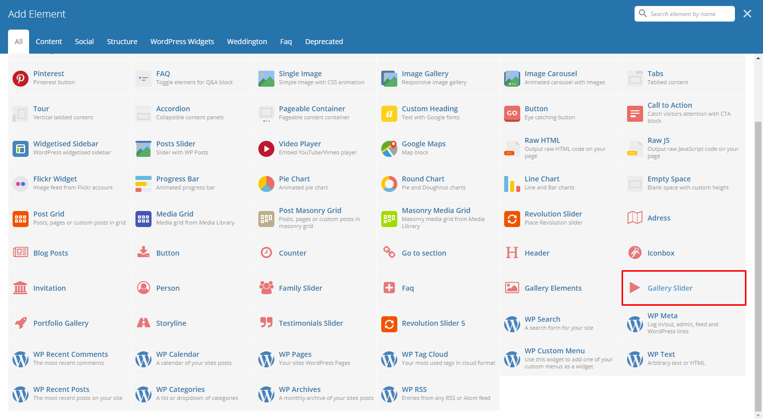
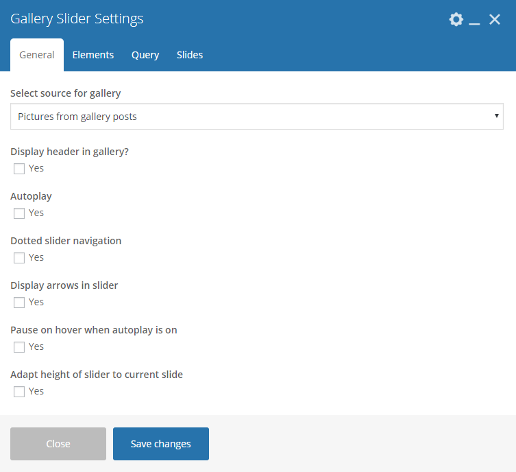
This element lets you add custom gallery or items from Gallery into a slider.
|
-General Tab-
- Select source for gallery - Select where to get the source of the gallery.
- Display header in gallery? - Option to display a header before the family slider.
- Autoplay - Option to make the slider move by itself.
- Dotted slider navigation - Option to show dotted slider navigation.
- Display arrows in slider - Option to show arrow slider navigation.
- Pause on hover when autoplay is on - Option to pause autoplay when the mouse pointer is hovering.
- Adapt height of slider to current slide - Option to adapt the height of the slider.
-Elements Tab-
Used when Select source for gallery is set to Pictures from custom content.
Note
Click toggle row to show Gallery Items options. To add more Gallery Items, click on the plus(+) sign.
Gallery Items -
- Type item title - Title of the item.
- Choose picture - Add an image to associate with the item.
-Query Tab-
- Limit - Set how many items will show. Set to -1 to show all.
- Skip X elements - Skip a number of elements from the results.
- Order - How the posts order looks.
- Order by - How the posts are ordered.
- Specify Gallery - Only selected posts are shown.
- Exclude Gallery - None of the selected posts will be displayed.
- Specify Gallery Categories - Only show posts under the categories.
- Exclude Gallery Categories - None of the posts under the categories are shown.
- Specify post tags - Only show posts with selected tags.
- Keyword search - Show items with certain keyword.
-Slides Tab-
- Slides to show - Number of slides to show.
- Slides to show on tablets - Number of slides to show on a tablet platform.
- Slides to show on phablets - Number of slides to show on a phablet platform.
- Slides to show on phones - Number of slides to show on a phone platform.
- Set initial slide - Set the initial slider that moves.
|
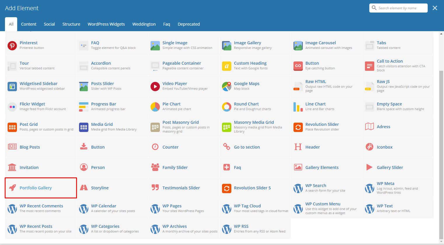
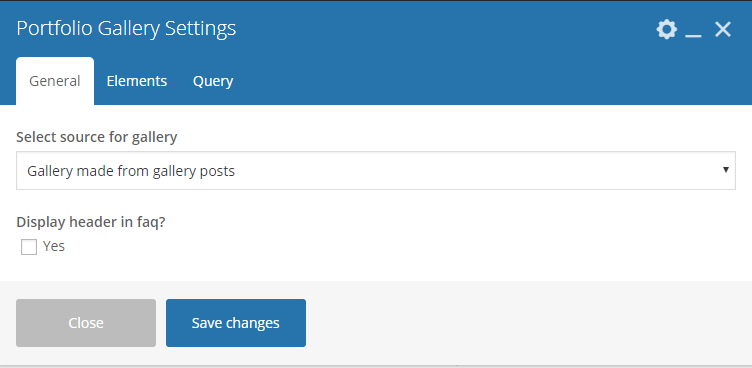
This element lets you add custom portfolio gallery or items from Portfolio.
|
-General Tab-
- Select source for gallery - Select where to get the source.
- Display header in portfolio? - Option to display a header before the family slider.
-Elements Tab-
Used when Select source for gallery is set to Gallery made from custom content or Pictures from custom content.
Note
Click toggle row to show Gallery Items options. To add more Gallery Items, click on the plus(+) sign.
Gallery Items -
- Type item title - Title of the item.
- Category for pictures - Add a category for the image.
- Choose picture - Add an image to associate with the item.
-Query Tab-
- Limit - Set how many items will show. Set to -1 to show all.
- Skip X elements - Skip a number of elements from the results.
- Order - How the posts order looks.
- Order by - How the posts are ordered.
- Specify Portfolio - Only selected posts are shown.
- Exclude Portfolio - None of the selected posts will be displayed.
- Specify Portfolio Categories - Only show posts under the categories.
- Exclude Portfolio Categories - None of the posts under the categories are shown.
- Specify post tags - Only show posts with selected tags.
- Keyword search - Show items with certain keyword.
|
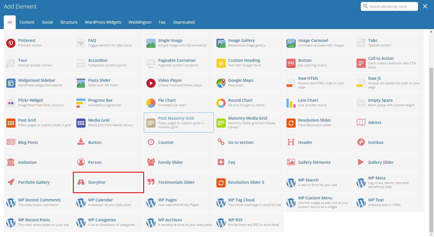
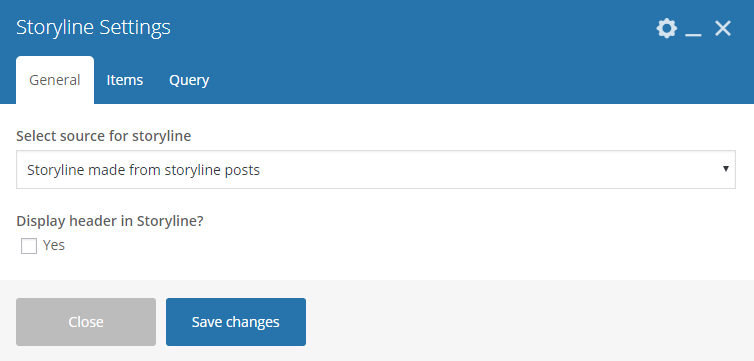
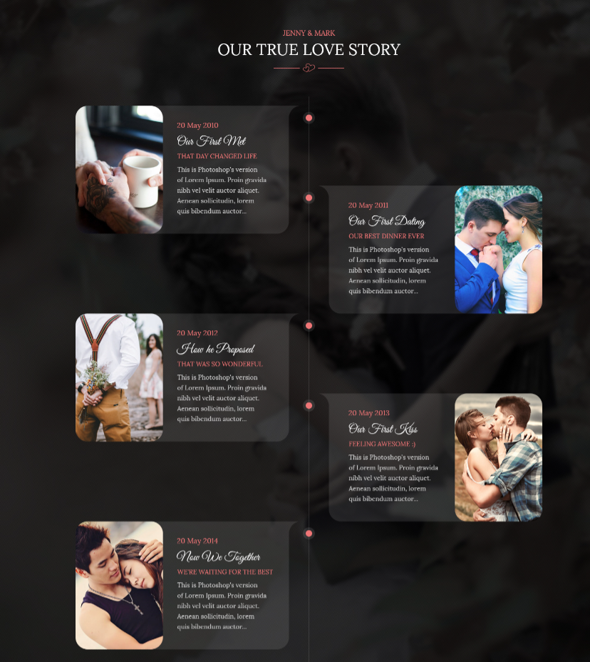
This element lets you add custom storyline items or items from Storyline.
|
-General Tab-
- Select source for storyline - Select where to get the source.
- Display header in storyline? - Option to display a header before the storyline.
-Elements Tab-
Used when Select source for storyline is set to Storyline made from custom content.
Note
Click toggle row to show Storyline Items options. To add more Gallery Items, click on the plus(+) sign.
Storyline Items
- Type item title - Title of the item.
- Type item subtitle - Subtitle of the item.
- Type item date use english format for example 20 january 2015
- Select item thumbnail - Add an image to associate with the item.
- Type content - Text content of the item.
-Query Tab-
- Limit - Set how many items will show. Set to -1 to show all.
- Skip X elements - Skip a number of items from the results.
- Order - How the posts order looks.
- Order by - How the posts are ordered.
- Specify Storyline - Only selected posts are shown.
- Exclude Storyline - None of the selected posts will be displayed.
- Specify Storyline Categories - Only show posts under the categories.
- Exclude Storyline Categories - None of the posts under the categories are shown.
- Specify post tags - Only show posts with selected tags.
- Keyword search - Show items with certain keyword.
|
|
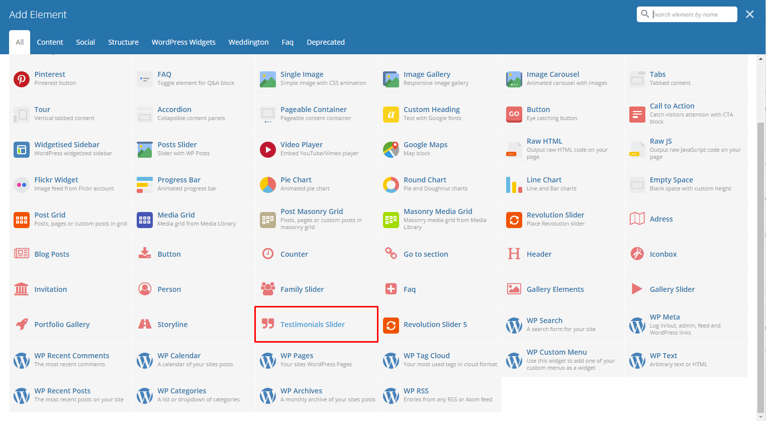
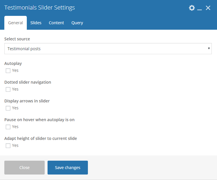
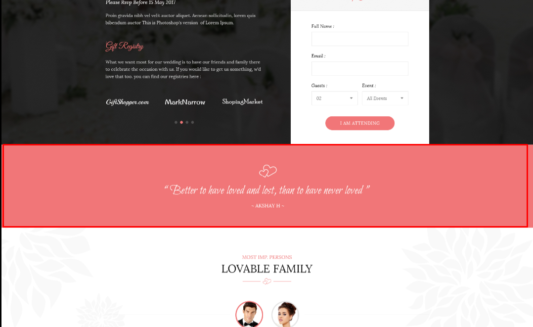
This element lets you add custom testimonial items or items from Testimonials.
|
-General Tab-
- Select source - Select where to get the source of the gallery.
- Autoplay - Option to make the slider move by itself.
- Dotted slider navigation - Option to show dotted slider navigation.
- Display arrows in slider - Option to show arrow slider navigation.
- Pause on hover when autoplay is on - Option to pause autoplay when the mouse pointer is hovering.
- Adapt height of slider to current slide - Option to adapt the height of the slider.
-Slides Tab-
Note
Turn on fade option is only applicable to 1 slider. If using more than 1 slide, uncheck this option for the slides to work properly. When showing odd numbered slides, the Use center mode will show.
- Slides to show - Number of slides to show.
- Slides to show on tablets - Number of slides to show on a tablet platform.
- Slides to show on phablets - Number of slides to show on a phablet platform.
- Slides to show on phones - Number of slides to show on a phone platform.
- Set initial slide - Set the initial slider that moves.
-Elements Tab-
Used when Select source for gallery is set to Custom content.
Note
Click toggle row to show Testimonial Items options. To add more Testimonial Items, click on the plus(+) sign.
Testimonial Items
- Type testimonial author - Name of the testimonial author.
- Type testimonial content - Text content of the testimonial.
-Query Tab-
- Limit - Set how many items will show. Set to -1 to show all.
- Skip X elements - Skip a number of elements from the results.
- Order - How the posts order looks.
- Order by - How the posts are ordered.
- Specify Testimonials - Only selected posts are shown.
- Exclude Testimonials - None of the selected posts will be displayed.
- Specify Testimonials Categories - Only show posts under the categories.
- Exclude Testimonials Categories - None of the posts under the categories are shown.
- Specify post tags - Only show posts with selected tags.
- Keyword search - Show items with certain keyword.
|